Senoko Energy Brand Refresh & Launch Campaign
Background
Ahead of the Open Electricity Market rollout in 2019, Senoko Energy sought to reposition itself for a broader mass-market audience.
As one of Singapore’s largest power generators entering a competitive retail landscape, the brand needed a refreshed visual and communication approach to remain relevant and distinctive.
Approach
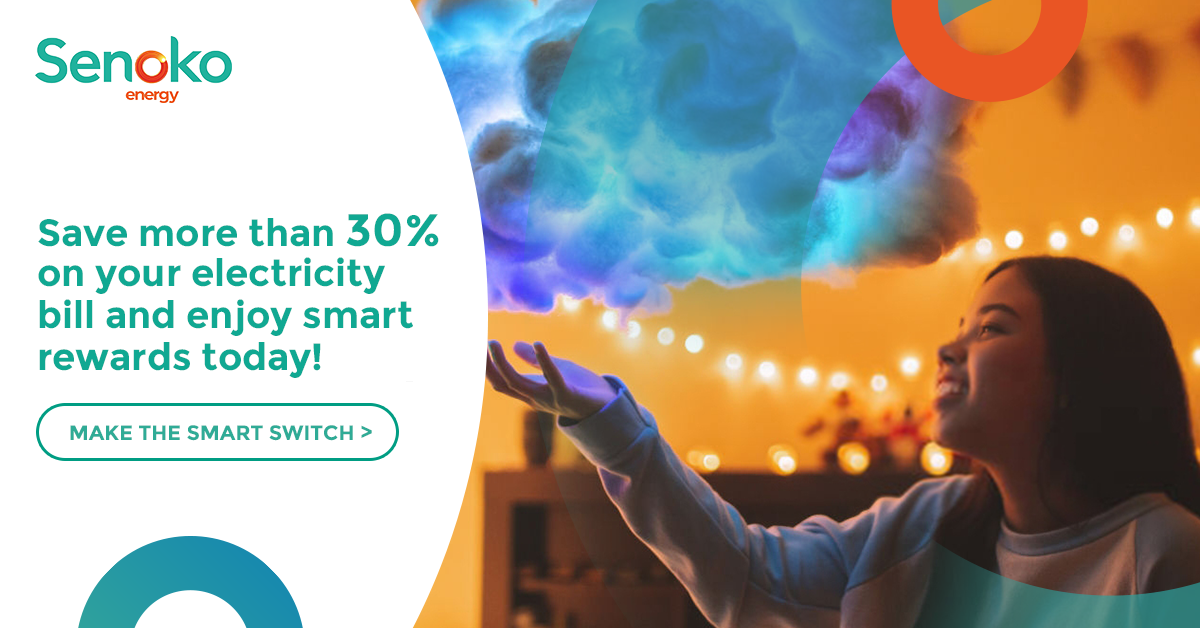
The visual identity was refined while retaining core brand logo and colour palette, repositioning Senoko Energy around “smart living.” The updated system introduced a more contemporary tone and adaptable design language to support the launch campaign across digital and offline channels.
Integrated Campaign · Visual Identity Refresh · Art Direction · Motion · Print · OOH


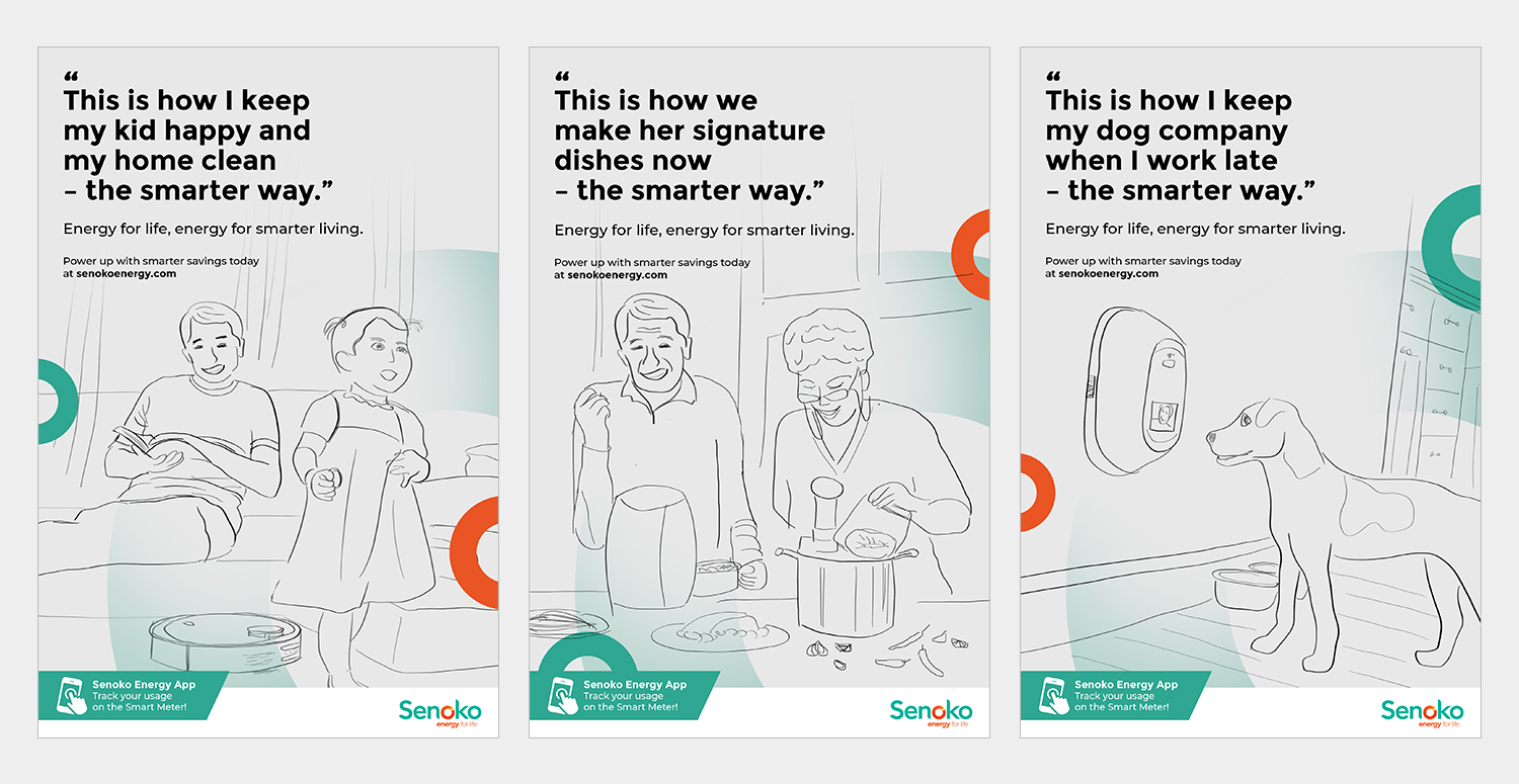
The graphic language for the brand design system is inspired by the energy swirl in the logo. Simplified rings are derived as graphic elements, which can be applied across various mediums such as print ads, social media and banners.


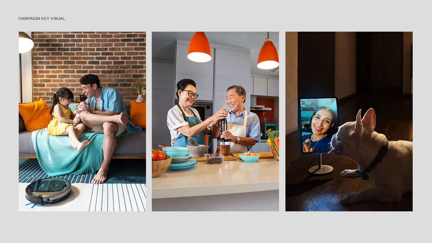
Campaign visuals and brand film highlight smart living moments, demonstrating how connected homes free up time for family.


Completed in GERMS Digital Ptd Ltd.